
A Redesign of Gathering In Light
I've been working on the redesigned of the site over the last few weeks using Claude Code. I have always enjoyed working on website designs, and have a number of favorite custom designs in the history of Gathering in Light:
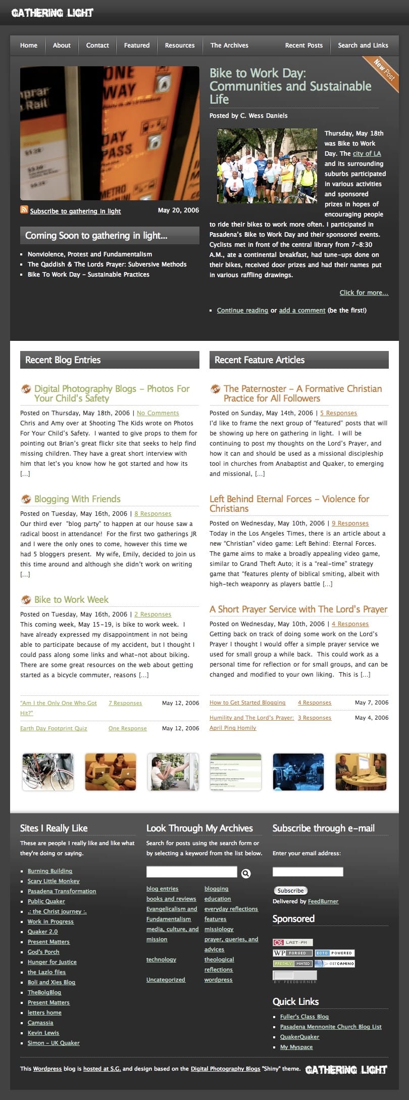
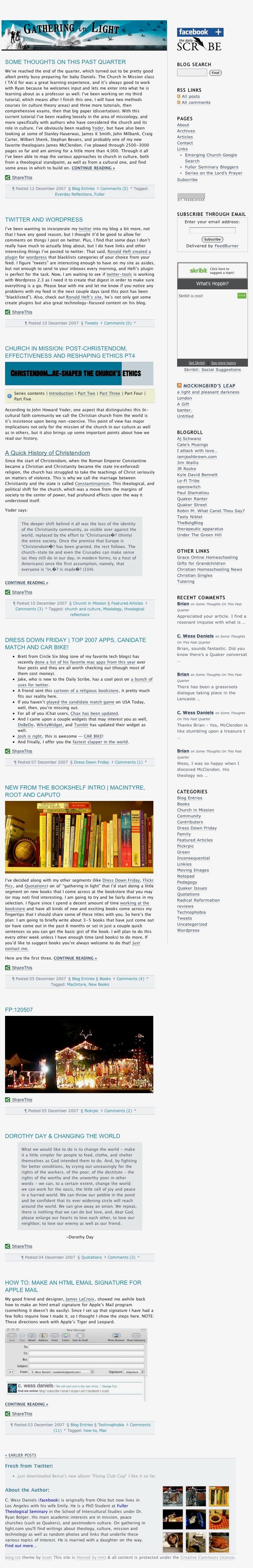
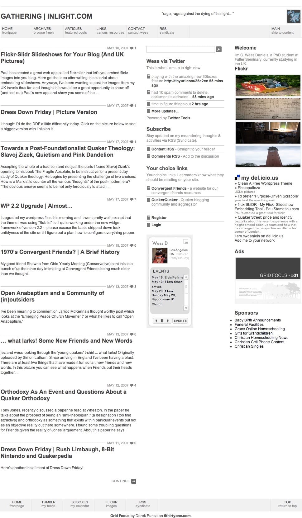
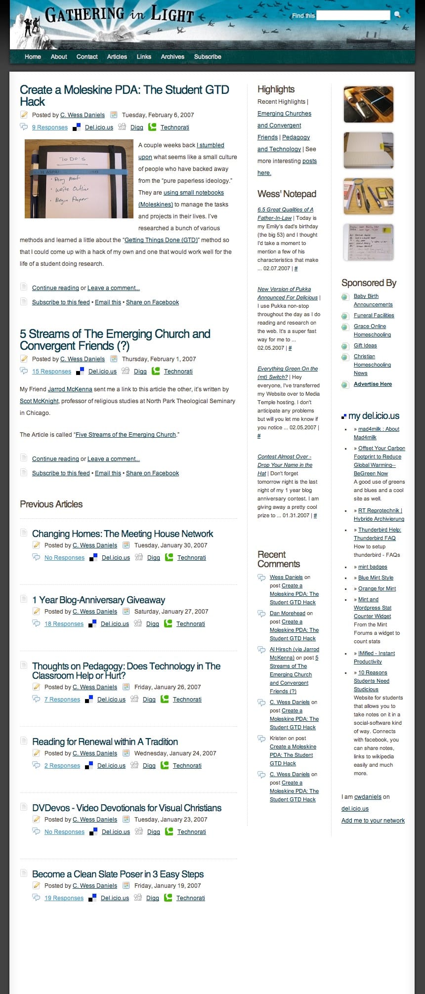
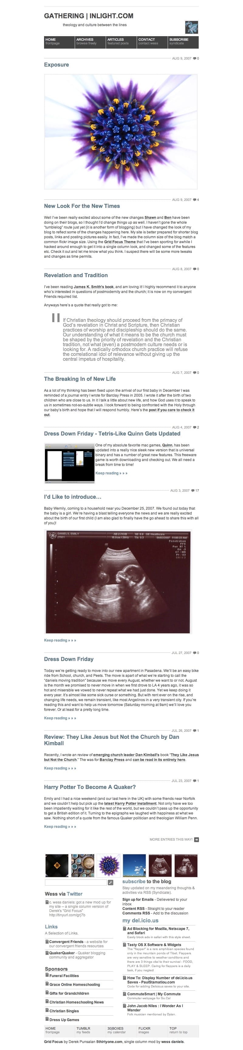
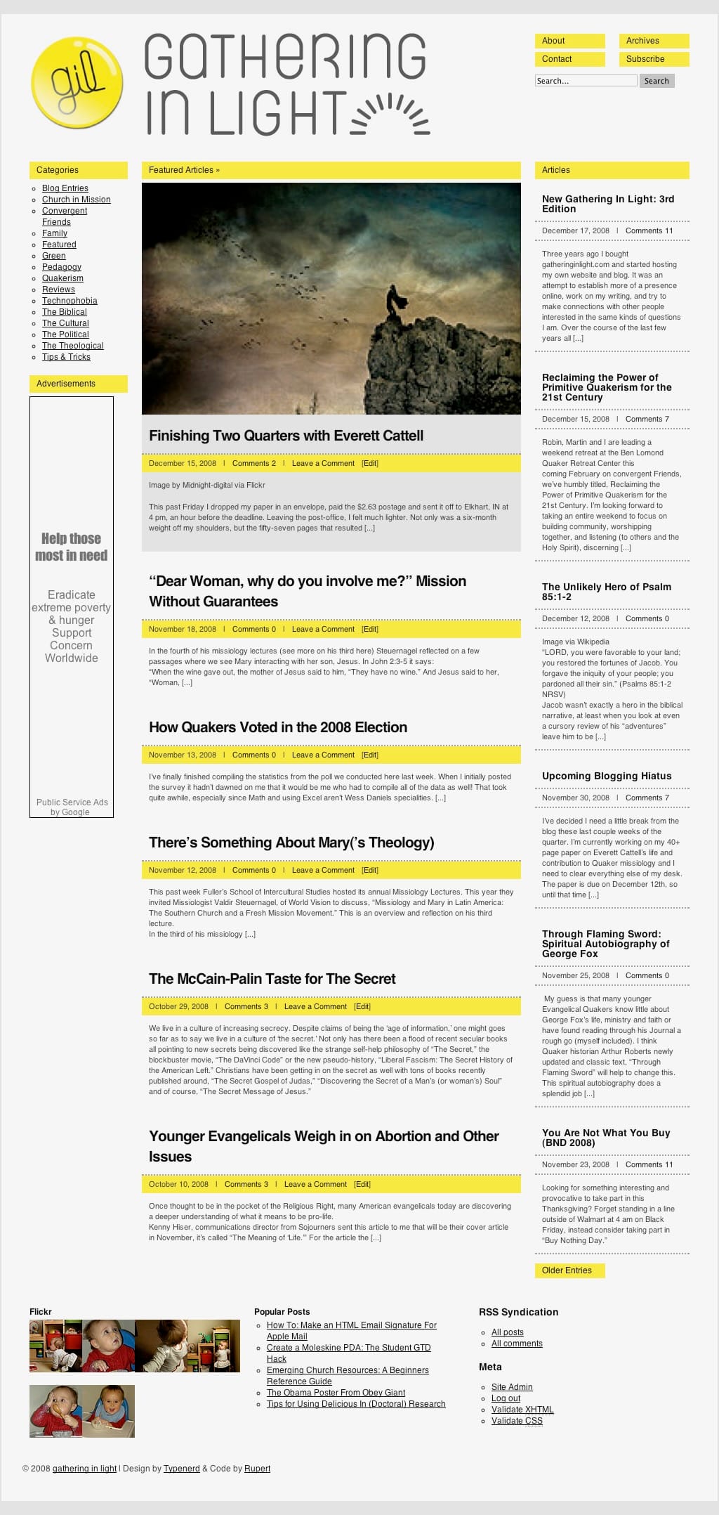
The new site takes heavy inspiration from the 2007 version of the site built by two friends in LA at the time. The grid theme allowed for posting of "blog posts" or shorter posts, and featured posts. This setup for two different kinds of content was originally inspired by an earlier theme "Shiny" that a friend ported for my use. The 2007 theme featured a new logo and bright yellows to play of "Light" in the site name. Here's that theme:
I've not done anything personalized since that point and since moving away from Wordpress, I've only been using templates built into my new platform ghost.
With the emergence of Claude Code, I decided I'd try my hand a redesigning the site based on Ghost's design features. While I don't know enough to code from the ground up, I do know enough of the behind the scenes for what is necessary using Claude. With enough time I was able to build the whole site, and with plenty of patience and lots of trouble-shooting too. Now it look and works the way I want it to.
A quick aside about using AI:
I must say that my relationship to AI has shifted quite a bit to being a proponent of it to being pretty against it (when it comes to using AI for thinking, creating ideas, writing, summarizing, etc). However, using something like Claude Code for a use like this where I am extending my abilities for my own personal use only feels slightly better. I wouldn't try to make money off of this or pass it off as my own work. I wouldn't try to package it and sell it either. I want to reiterate that I'm actively looking to remove AI from a lot of my apps - I see so many places where it is being forced on us. Here is one place where I see it differently, at least for now.
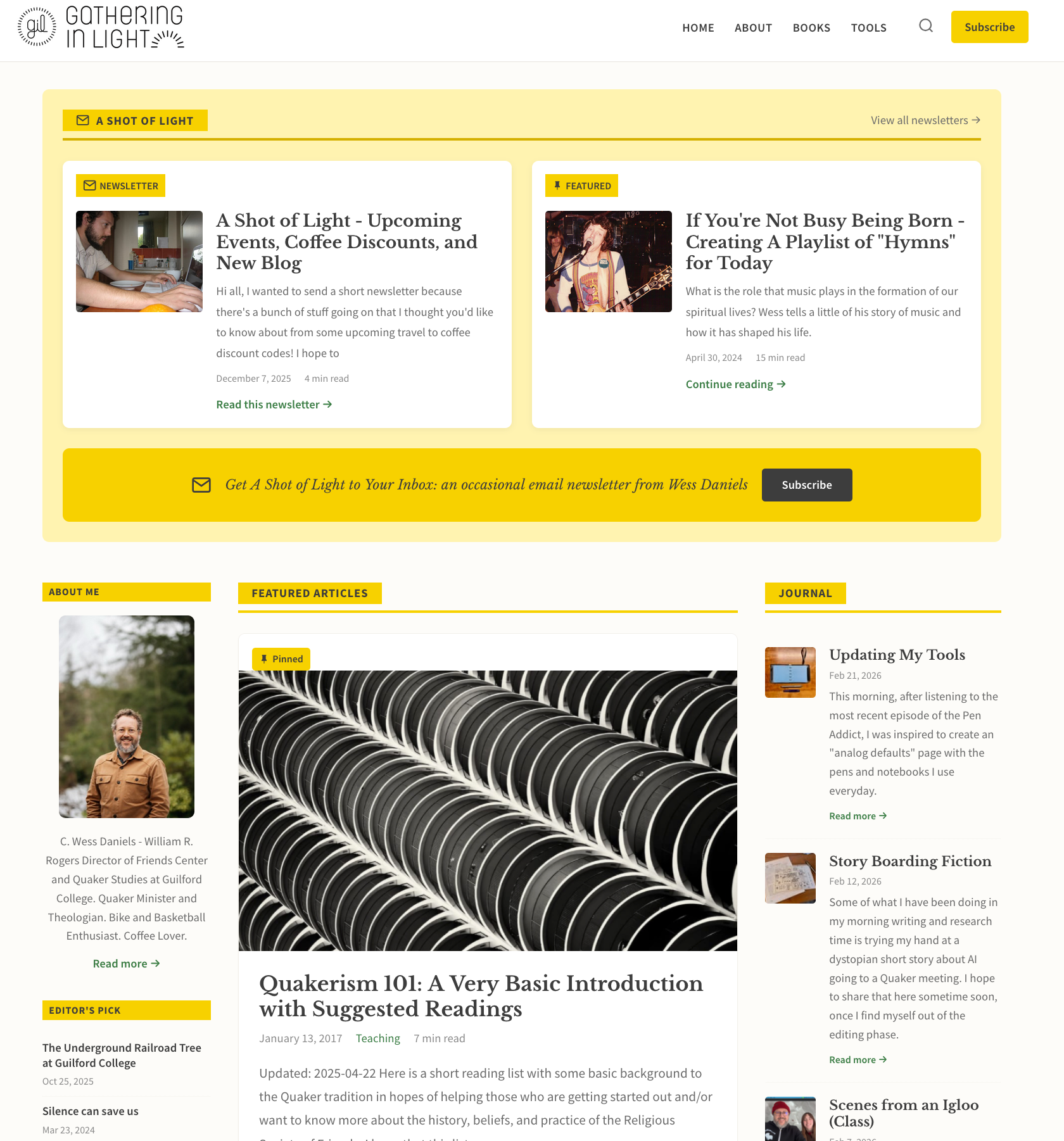
I've added some new features and now display three types of content: newsletters, featured posts, and blog posts. This allows the site to continue to adapt to the various ways I am using the site. I've also added a sidebar to point folks to "editor's picks," an old school blogroll, and a few more tricks under the sleeve (see the footer).
Take a look around and let me know what you think of the new site:

Design Features of the new blog theme compiled by Claude Code:
Layout & Structure
- Three-column layout: left sidebar, main content area, and journal column
- Responsive design — sidebar hides at 1024px, columns stack at 768px for mobile
- Warm, off-white background with clean card-based design
Homepage Sections
- A Shot of Light — latest newsletter pinned alongside a featured/pinned post, styled as matching cards with feature images, excerpts, and reading time
- Subscribe CTA bar — email icon with call-to-action on the yellow background, linking to Ghost's portal signup
- Featured Articles — curated featured posts (with deduplication from the pinned spot) followed by recent essays
- Journal — right column with shorter blog post entries
Left Sidebar
- About Me — author photo and bio pulled from site profile
- Editor's Pick — four hand-curated posts tagged editors-pick
- Categories — icon-labeled links to Newsletter, Essays, Blog Posts, Sermons, Quakerism, and Teaching
- Blogroll — links to favorite sites with RSS icons
Footer & Fun Zone
- Streamlined footer with Connect section (Email, Mastodon, BookWyrm, Ghost Fediverse, Signal)
- Layout toggle — buttons to switch between single column (I), two columns (II), and three columns (III)
- Vibe toggle — four CSS themes with localStorage persistence:
- Normal — warm off-white with golden yellow accents
- Pink Panther — dark background, hot pink accents, Pacifico script font
- Punky Brewster — deep purple background, rainbow gradients, Fredoka One font
- Inspector Gadget — dark steel background, electric blue accents, Share Tech Mono monospace font
- Layout and theme preferences saved across sessions via localStorage
Typography & Color
- Libre Baskerville serif for body text, Source Sans Pro sans-serif for UI elements
- Link color inspired by the green from the cover of A Convergent Model of Renewal
- Golden yellow (#F7D000) primary accent color drawn from the site logo
- Hyperlinks styled with green text and yellow highlight background on post and page content
Other Details
- Lazy-loaded images with IntersectionObserver
- Smooth scrolling for anchor links
- RSS feed link in the footer
- Google Fonts loaded for the 80s theme variants